

Your company already has a logo, colors and fonts defined — but every piece that goes out seems to come from a different brand. The website has one style, Instagram has another, the business card has a third. If this sounds familiar, the problem is not aesthetics. It’s a system.
A coherent visual identity is the set of rules and standards that ensures all the elements of your brand — logo, colors, typography, images, writing tone — work together, on any channel, without contradictions. It is what separates a brand people recognize from a brand people forget.
In this article, I explain what makes up a coherent visual identity, why maintaining this consistency is hard in practice, and how to structure a brand system that works without constant supervision.
What a coherent visual identity is — and what it is not
Many people confuse having a visual identity with having a coherentvisual identity. They are different things.
Having a visual identity means your brand has defined graphic elements: logo, colors, fonts. Most companies get this far.
Having a coherent visual identity means these elements are applied the same way, by anyone, on any piece, without the final result depending on who was at the computer that day.
The difference is not in the design. It’s in the organization.
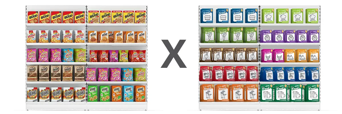
Why visual consistency matters for your business
When visual identity is coherent, three things happen predictably:
1. Immediate recognition
Consistent brands are recognized before they are read. The audience identifies the color, the style, the spacing — and knows whose piece it is. This recognition only comes from organized repetition, not from random creativity.
2. Trust
Consistency communicates seriousness. When everything is aligned, the audience senses — often unconsciously — that there is organization behind that brand. Inconsistency, on the other hand, breeds doubt.
3. Real differentiation
In the market, most companies in the same segment look alike. A brand with a coherent visual identity stands out not through noise, but through clarity.
The pillars of a coherent visual identity
Building a consistent brand system requires attention to five elements:
1. Logotype and symbol
The logotype is the fixed point of the system. It needs to work at different sizes, on light and dark backgrounds, in print and on screen. More than beautiful, it needs to be versatile — and have clear usage rules.
2. Color palette
Colors evoke associations and build brand memory. A well-defined palette — with primary and secondary colors and usage rules — ensures that any piece, by any designer, keeps the same visual standard.
3. Typography
The chosen fonts define the brand’s “visual tone”. Consistent use of typography — same fonts, same weights, same hierarchy — ensures that all of the brand’s texts, from the website to the e-mail, speak the same language.
4. Image style
Photographs, illustrations and icons are also part of the identity. Mixing visual styles — corporate photos with casual illustrations, for example — breaks coherence even when colors and fonts are right.
5. Brand guidelines (visual identity manual)
This is the document that makes the system work. It records all the usage rules for the elements above — and it is what allows anyone on the team, or any outside supplier, to apply the identity correctly without having to guess.
Without a manual, visual consistency depends on a specific person. With one, the brand works regardless of who is executing.
A coherent visual identity is not a project — it is an ongoing system
Here is the point most companies underestimate: building the visual identity is the easy part. The challenge is keeping it coherent as the company grows.
New products call for new pieces. New platforms call for new formats. New people on the team apply the rules in different ways. Over time, consistency is lost — not out of ill will, but for lack of a system.
Keeping a visual identity coherent over time requires:
- Living documentation (up-to-date brand guidelines)
- Clear processes for creating and approving pieces
- Periodic review to identify where the identity was not respected
- Someone responsible for the system — internal or external
At QuartaDesign, I work specifically on this problem: I take over the brand system, organize the rules and make sure the visual identity stays consistent even as the team grows, suppliers change or the company enters new channels.
Conclusion
A coherent visual identity is not about aesthetics. It’s about a system. It is the set of rules and standards that ensures your brand is recognized, conveys trust and stands apart — regardless of who is creating the pieces.
If your brand already has a visual identity but the pieces come out inconsistent, the problem is not the design. It’s the lack of a documented, working system.
Want to build this system? Get in touch and tell me where your brand’s problem is. The initial conversation is free and usually points to the next steps.
Frequently asked questions about coherent visual identity
What does it mean to have a coherent visual identity?
It means that all the visual elements of your brand — logotype, colors, typography, image style — are applied consistently across all channels and materials, regardless of who created them.
What is the difference between visual identity and brand guidelines?
Visual identity is the set of a brand’s graphic elements. Brand guidelines (or visual identity manual) are the rules for how to use those elements correctly. One does not work well without the other.
Why does my brand look inconsistent even though it has a defined logo and colors?
Because having defined elements is not the same as having a documented system. When the rules exist only in the original designer’s head, any new piece — made by someone else or years later — can break coherence.
How long does it take to build a coherent visual identity?
It depends on the brand’s current state. For companies that already have a visual identity but need to organize and document the system, the process usually takes 3 to 6 weeks. For brands starting from scratch, it takes longer.
Is a coherent visual identity only for large companies?
No. Medium-sized and small companies that keep visual consistency convey the same professionalism as large brands — and stand apart from most competitors that don’t take this care.