

In the highly competitive world of business, a coherent visual identity is essential to the success of any brand. At QuartaDesign, we understand that visual coherence is not just aesthetics, but a crucial strategy for communicating a company’s values to its consumers.
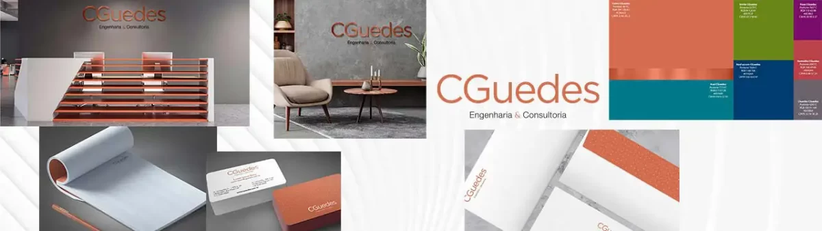
What Is Visual Identity?
Visual identity is made up of all the graphic elements that represent a brand, from the logo, colors and typography to the shapes and images used in promotional materials. It is the first impression a company makes on the public, a silent message that communicates what the brand stands for.
The Impact of Visual Identity on Brand Perception
- Recognition and Recall: A coherent visual identity helps solidify brand recognition. Companies that keep visual consistency across all touchpoints are more likely to be remembered by consumers.
- Trust and Credibility: Consumers tend to trust brands that present a professional, well-organized image. Visual coherence conveys credibility and trust, which can be decisive in a purchase decision.
- Market Differentiation: In saturated markets, visual identity can be a differentiating factor. A unique and consistent presentation lets the brand stand out from the competition.
- Communicating Values: Colors, shapes and design are not chosen by chance. They have the power to communicate the company’s values and philosophy in a subtle but effective way.

How to Create a Coherent Visual Identity
- Research and Analysis: Get to know your target audience deeply so you can create visual elements that resonate with them.
- Define Visual Guidelines: Create a style guide where logos, typography, colors and other visual rules are clearly established.
- Consistency Across Channels: Make sure all marketing and communication materials are developed according to the visual guidelines, keeping coherence online and offline.
Inspiring Examples
Nike, for example, is a master at keeping a strong and coherent visual identity. Its iconic “swoosh” is instantly recognizable and conveys dynamism and innovation. At Apple, the simplicity and innovative design of its visual communications reflect its commitment to quality and innovation.
Conclusion
Defining a coherent visual identity is not a task to be neglected. With QuartaDesign’s integrated and tailored approach, your brand will not only be remembered, but also trusted and respected, reaching its true potential in the market.
Here at QuartaDesign, we are ready to help you develop a visual identity that resonates with your target audience and genuinely reflects your brand’s values. Talk to us to turn your business’s visual presence into a success story.
This article aims to clarify the relevance of a coherent visual identity and its advantages for the success of a brand, reinforcing QuartaDesign’s commitment to delivering visual solutions of excellence.