
Context (Before)
Adigo is one of the most traditional Brazilian organizational development consultancies. After more than 35 years with the same logo, the partners began a deep internal reflection on brand, essence, principles and language.
During this process — built by the partners themselves — it became clear that the original logotype still conveyed the spirit of the consultancy very well. However, there were real challenges:
- Difficulty reading the logotype in applications alongside other brands
- No up-to-date visual system to match the new positioning
- No expanded palette to represent the company’s current moment
- A need to organize all production of presentations, content and client materials
Challenge
- Improve the legibility of the logotype without losing the brand’s DNA
- Expand the visual identity while keeping historical continuity
- Turn the partners’ internal content into a structured, practical BrandGuide
- Create a unique visual language that reflects how Adigo runs its workshops
- Reduce rework in creating presentations, handouts and sales materials
- Modernize communication without stripping the brand’s tradition
The System (Solution)
QuartaDesign developed an evolutionary visual identity system, preserving the soul of the brand and projecting Adigo into a new cycle of work.
Main deliverables:
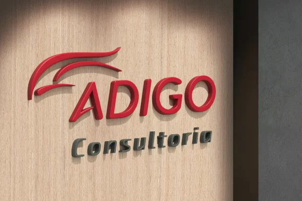
- Technical adjustment of the logotype
Improved proportions and increased weight and size of the text for legibility alongside other brands. The main color was kept — strengthening continuity and tradition. - New Color Palette
Creation of an expanded, contemporary palette aligned with the consultancy’s new positioning. - Structured and Comprehensive BrandGuide
Compiling and organizing all the material created by the partners on:
Identity and purpose
Principles and values
Verbal language
Positioning and narrative
Brand usage guidelines
Visual structure for presentations and materials - Icon and Divider Language
Developed from the hand drawings the partners make on flipcharts, turning an essential Adigo ritual into a visual signature of its own
- Image Curation + Royalty-Free Library
Selection of images aligned with the new line of thinking and creation of a standardized library for the whole team. - Complete New Stationery
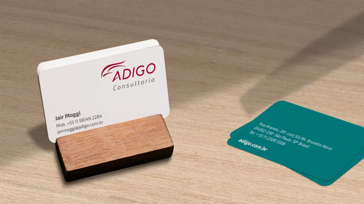
Institutional material revised with the new palette, icons and visual signature. - Special Section for Presentations
Inside the BrandGuide, we created a dedicated area with:
3 complete presentation themes
Slide templates
Chart templates
Typography and color usage guidelines
Practical tips for building high-impact presentations - Drawing Language for Workshops
Creation of exclusive illustrations representing each of Adigo’s workshops — reinforcing identity and making them easier to understand. - Communication Pieces and Teaching Materials
E-mail marketing, handouts, support materials and hundreds of illustrations built on the visual identity.