Spiritist center in Santo André, Brazil, since 1991
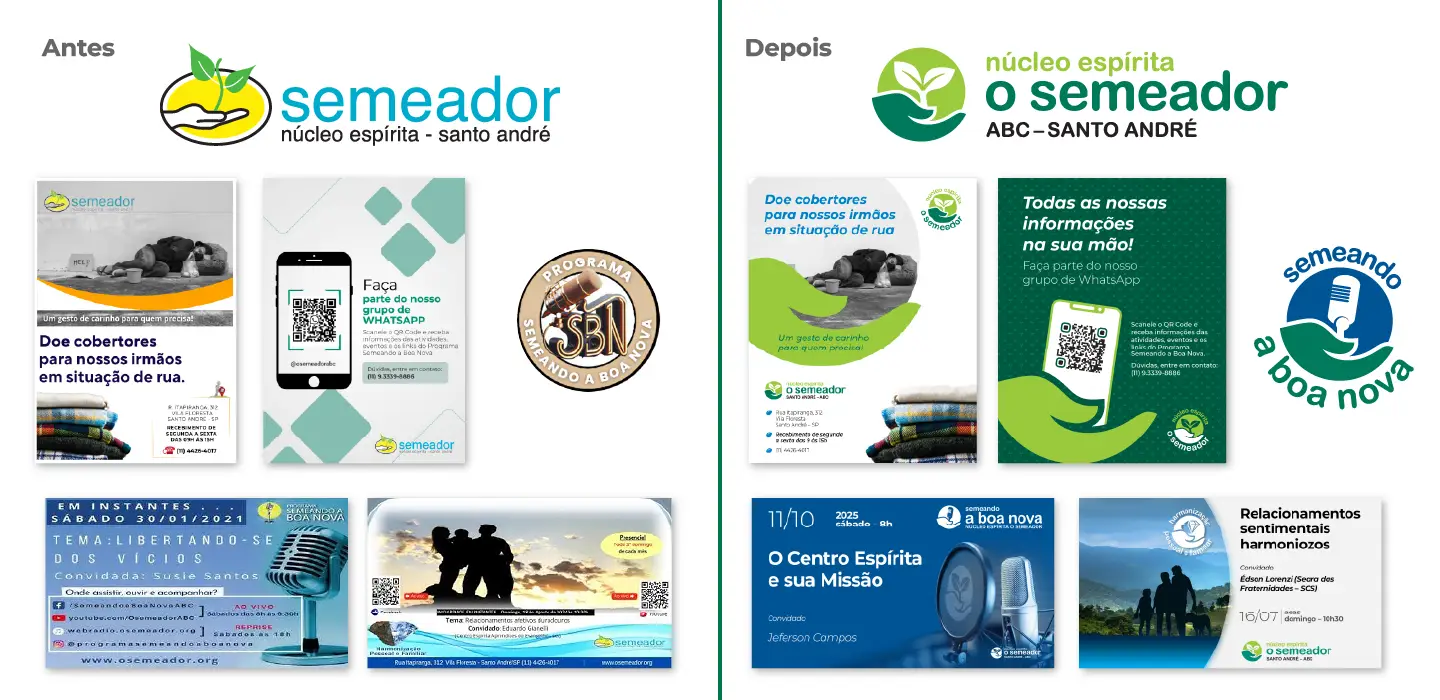
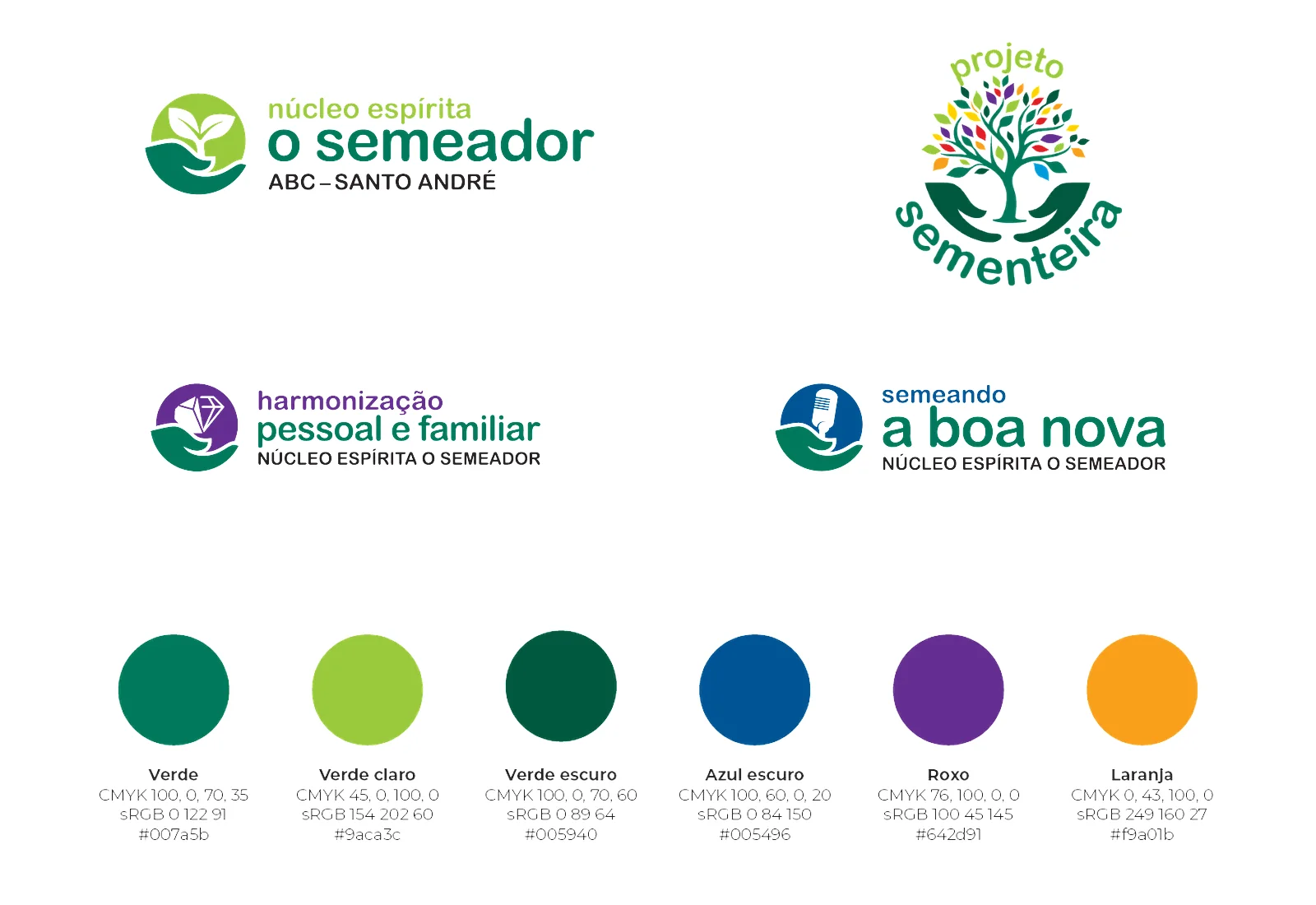
Institution logo and 3 redesigned program brands
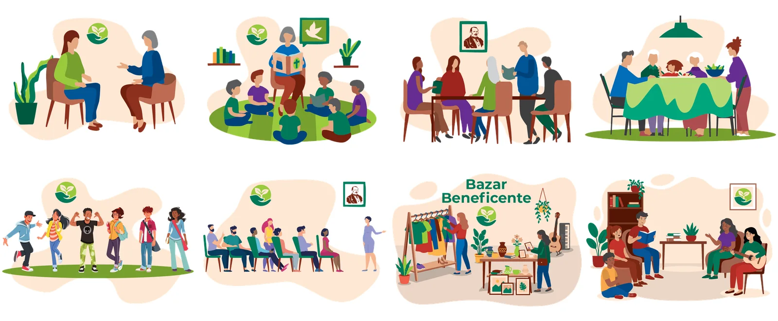
Exclusive illustrations for the website and communications
Identity manual and all materials delivered in Canva
Background
Núcleo Espírita O Semeador is a nonprofit in Santo André, in the ABC region of greater São Paulo, Brazil. Since 1991 it has welcomed the community with public talks, study groups, the radio and internet program Semeando a Boa Nova, a charity bazaar, food distribution and Projeto Sementeira, which supports children and teenagers with learning disorders.
They came to us unhappy with the mess. Logos and communications came out in different styles, and anyone looking from the outside could not tell it all came from the same institution.
The challenge
Create an identity that:
- Unites the institution and its programs under one brand, without erasing the personality of each;
- Conveys what O Semeador is: welcome, simplicity and hope;
- Is simple to use for a team of volunteers;
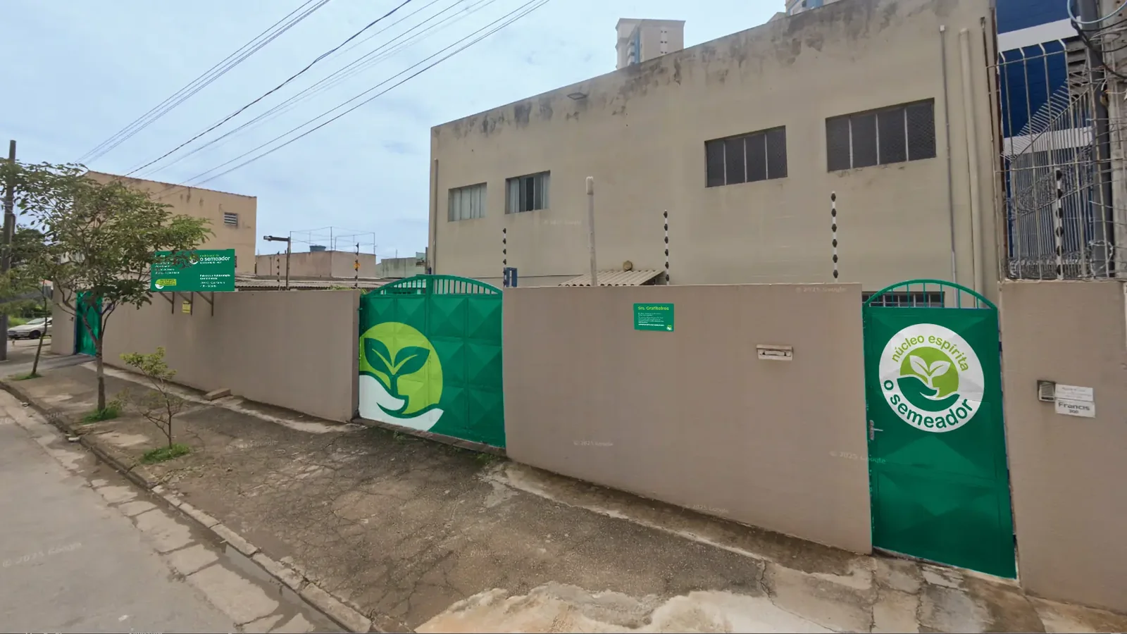
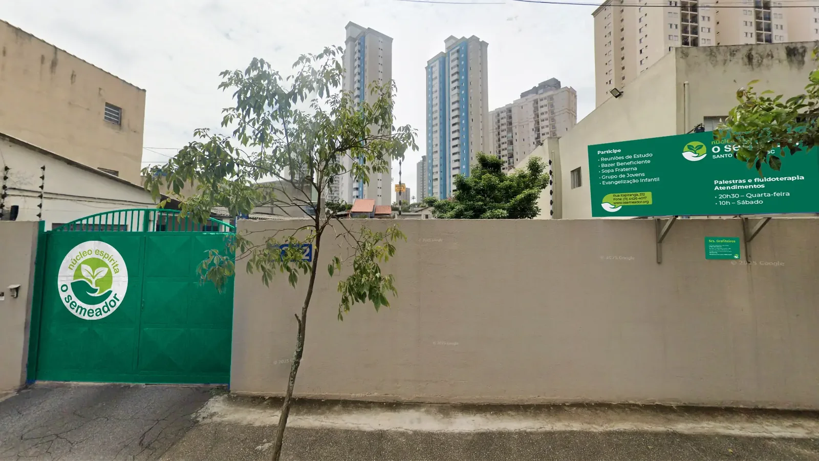
- Works from the front gate to YouTube, through brochures, T-shirts and presentations.
The solution
We started from the symbol, which became a sprout on an open hand: the gesture of someone who sows and welcomes. From it came a family of brands, with its own colors for each program and the same drawing behind them.
Main deliverables
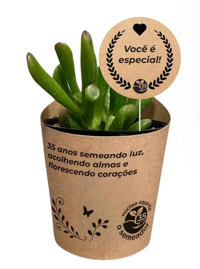
- Institution logo and a commemorative 35th-anniversary version;
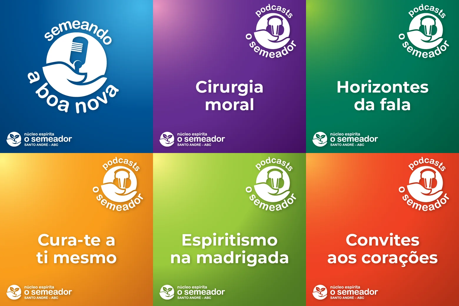
- Program brands for Semeando a Boa Nova, Harmonização Pessoal e Familiar (Personal and Family Harmonization) and the podcasts;
- Redesigned Projeto Sementeira logo, with the colorful tree resting on the hands of the O Semeador symbol;
- Visual identity manual covering logo usage, palette, typography (Montserrat) and applications;
- Illustrations for the website and promotional pieces;
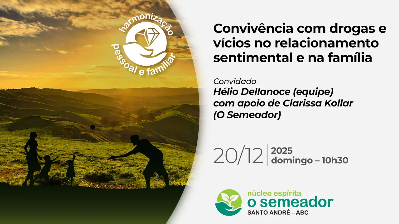
- Presentation style for in-person events, with artwork projected at talks and broadcasts;
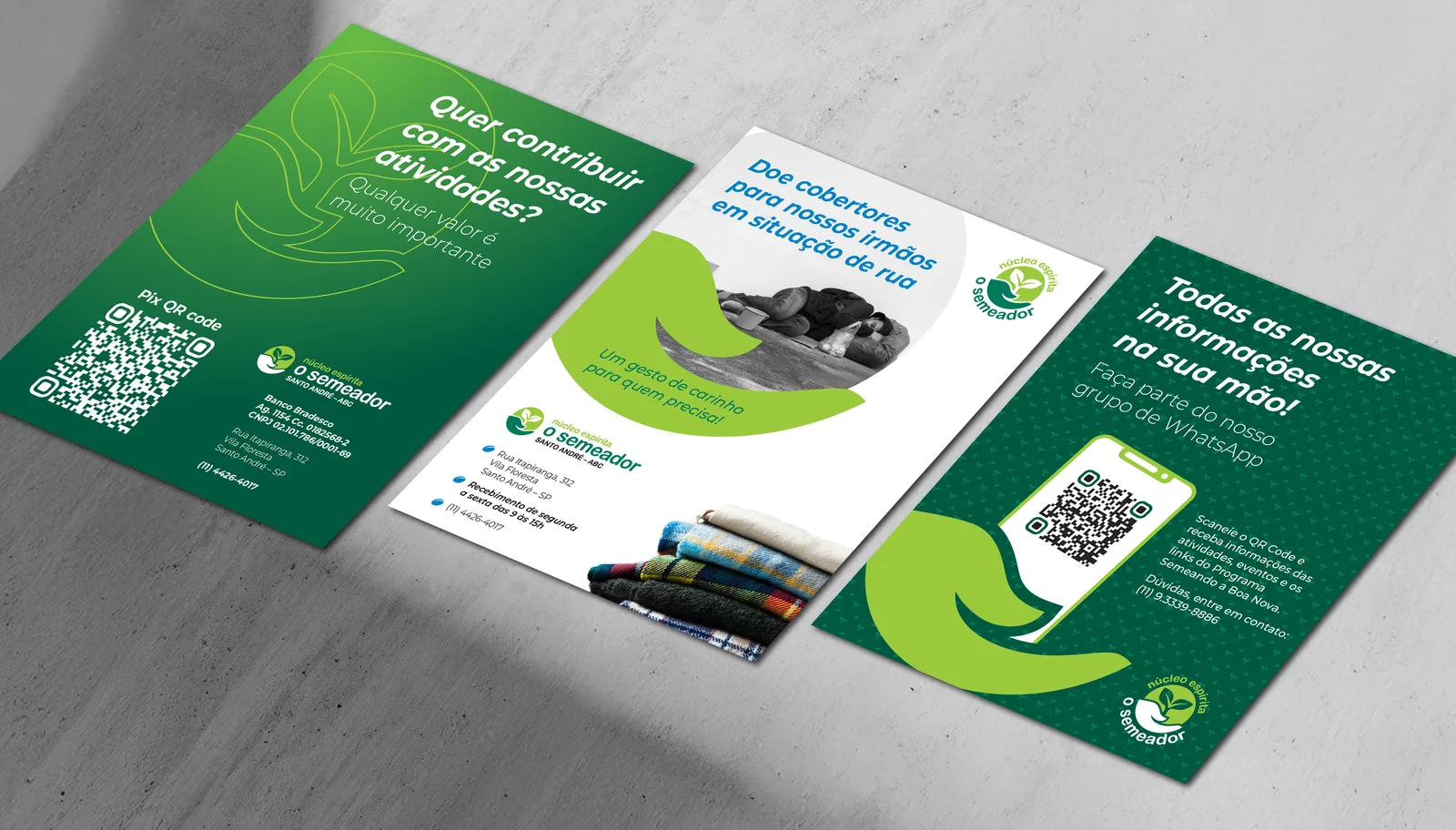
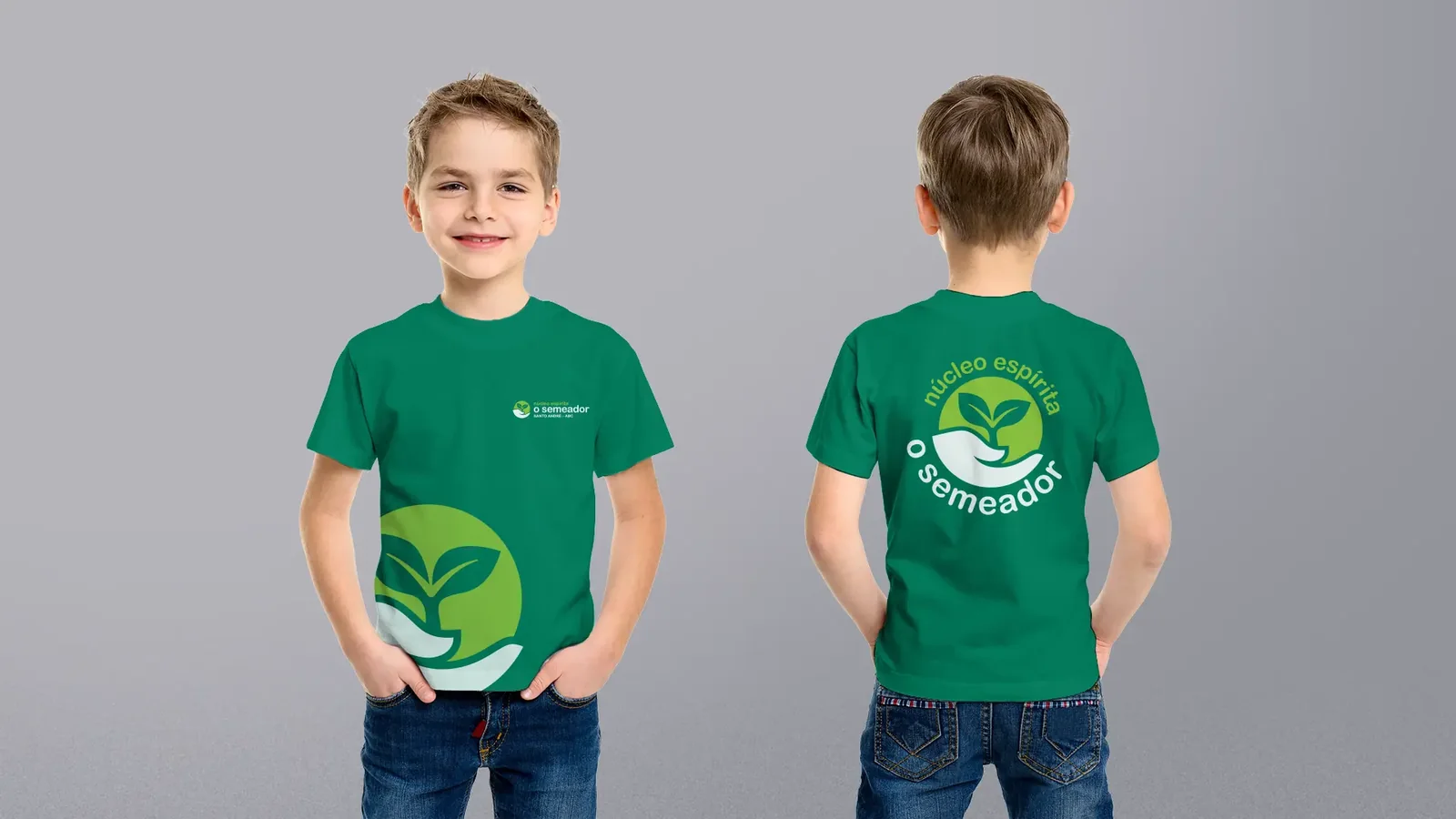
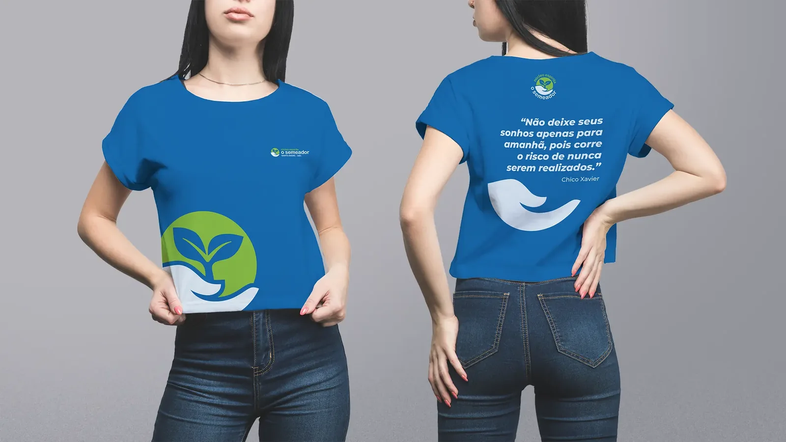
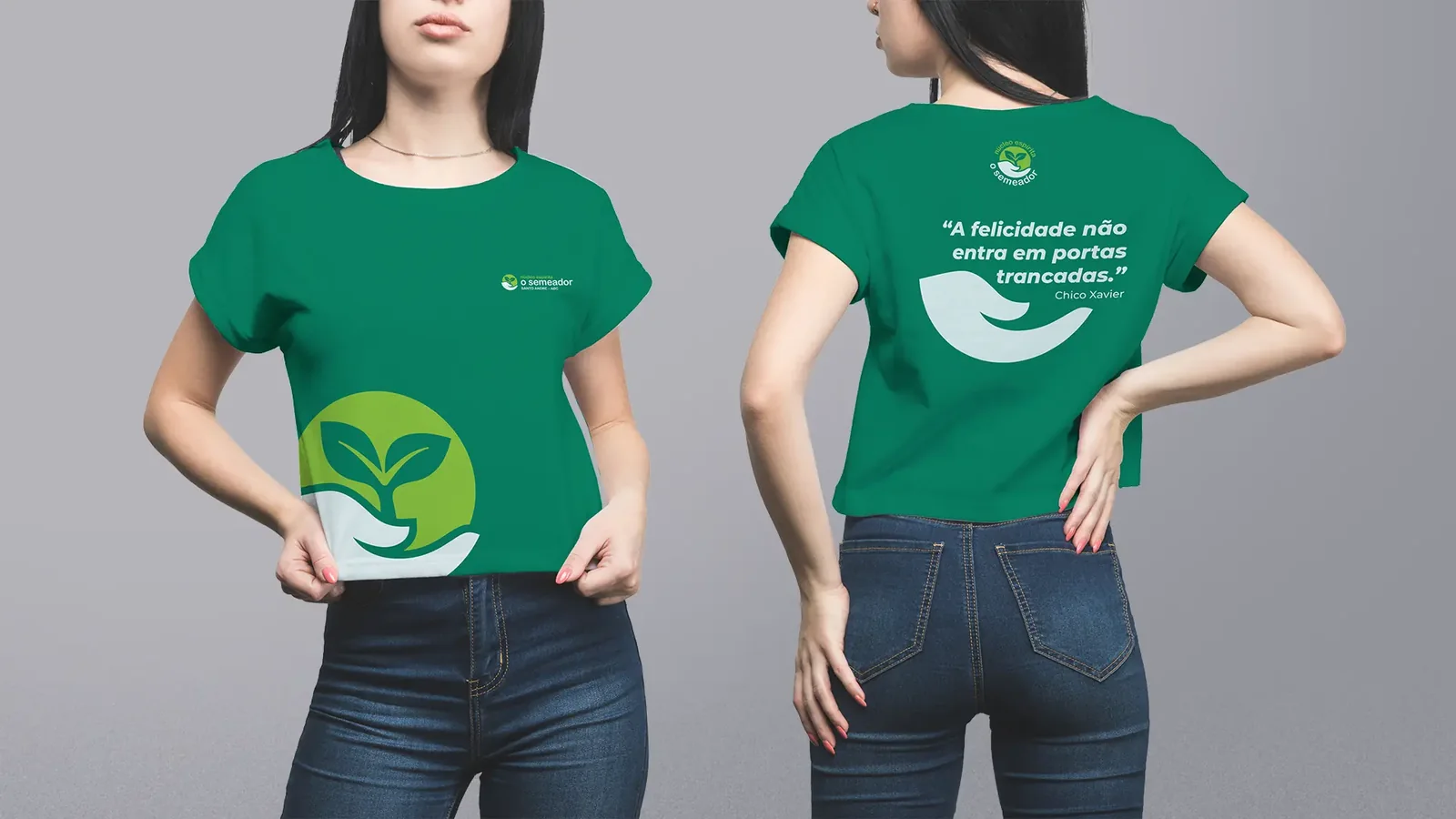
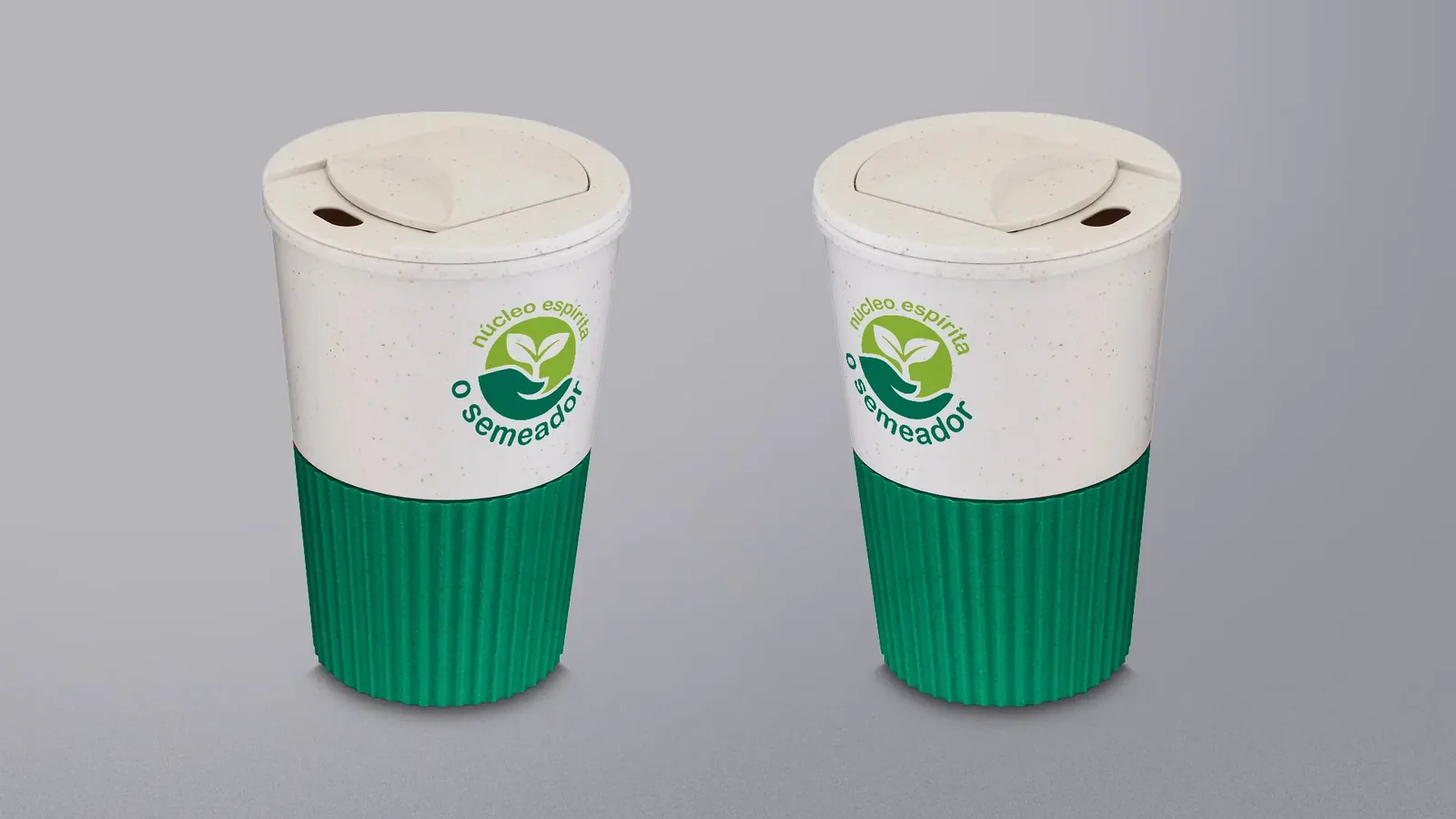
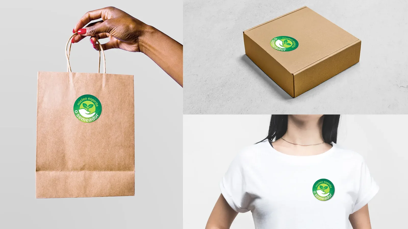
- Brochures, stationery, T-shirts and merchandise;
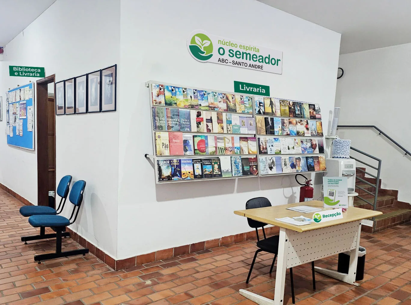
- Signs and signage for the gate and the reception;
- Videos and jingles for the programs;
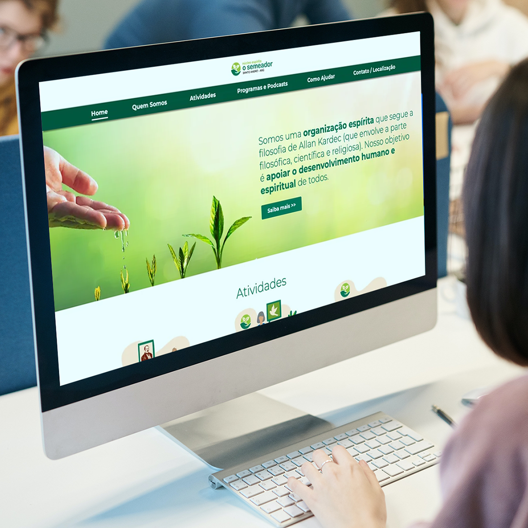
- Website with the new identity.
Everything in Canva
The O Semeador team works in Canva, and the identity had to live there. So we delivered the visual identity manual inside Canva itself, with all the images and collateral loaded and ready to use.
We also registered the institution as a nonprofit in Canva, and O Semeador now uses the Pro version at no cost.
Results
- One single brand, recognizable at every touchpoint;
- Programs with their own identity, yet clearly part of the same family;
- A team with ready-made Canva templates to produce promotional pieces within the standard;
- Gate, reception, T-shirts and talk screens all speaking the same language;
- More polished and coherent materials, from one program to the next.
Logo and brand family
Illustrations
A website that welcomes everyone who arrives
The website is the front door for people who do not yet know the center, and it was designed as an invitation. The home page introduces O Semeador right at the top and then shows the six activities. Each has its own illustration and the day and time highlighted, so visitors quickly find out when they can take part.
Other pages explain the programs and podcasts, how to help and how to get there. Contact by phone, WhatsApp and form is always at hand, including in the footer. And everything adapts well to mobile.
Promoting the programs

Podcasts
Brochures
T-shirts and merchandise

Stationery
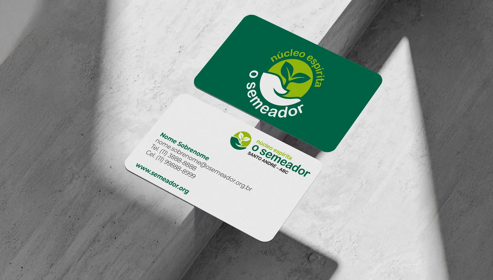


Signage