

You opened Canva, ChatGPT, Firefly or some other AI tool. You typed a prompt. The result came out beautiful — vibrant colors, modern layout, fluent text.
But when you looked again, something was off.

The font wasn’t yours. The colors didn’t match your brand’s. The tone didn’t sound like your company. The piece could belong to any brand — except yours.
This is one of the most common problems I see in companies that have started using AI to create materials. And the cause is rarely the tool.
The cause is that visual identity and artificial intelligence are still not connected — because the identity is not organized into a system.
Why AI “gets” your brand wrong
Artificial intelligence has no memory of your brand. It doesn’t know that your green is exactly #00765a. It doesn’t know that you use Gotham Bold for headings and never use italics. It doesn’t know that your tone is direct and expert, neither casual nor corporate.
AI works with what you provide in the prompt. If you provide little — “create a piece for my company” — it fills in the gaps with generic stock-image patterns and the visual trends of the moment.
It isn’t getting it wrong. It’s doing what it can with what it has.
The central point about visual identity and artificial intelligence is this: AI doesn’t create brand problems. It works within the limits of what you provide. And when you provide nothing specific, it makes things up.

The cost of letting AI make things up
When AI creates without a clear reference, the result is inconsistency at scale.
Before, a post made by a designer trained on your brand had an 80% chance of coming out right. Now, with AI and no system, you can produce ten times more pieces — but ten times more inconsistent.
The audience’s perception is cumulative. Each off-standard piece weakens the brand’s credibility a little. Rework increases. The team spends time fixing instead of producing. And the feeling that “AI doesn’t work for our brand” begins to emerge.
AI works. What is missing is the system that guides it.
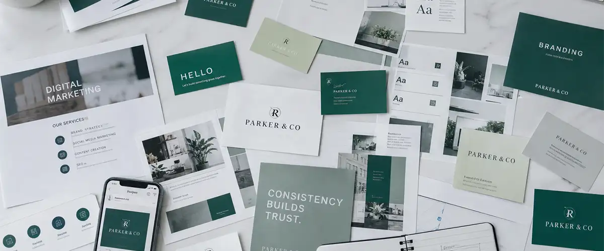
Logo, colors and fonts are the start — not enough
When I ask a client whether they have a visual identity, the answer is almost always “yes”. And when I ask to see it, they send me the logo in three versions, a color table and the names of two fonts.
That is a starting point. It is not a system.
For the relationship between visual identity and artificial intelligence to really work, your identity needs to be documented in depth — not just the what, but the how and the why of every visual decision.
A complete brand system includes, at a minimum:
- Colors — with hex, RGB and CMYK codes, and the usage rules for each one (which is primary, which is support, which never goes on a dark background)
- Typography — not just which fonts, but size, spacing, weight and the hierarchy between title, subtitle and body text
- Photographic style — what kind of image represents the brand, which does not, what the light is like, what the photo palette is
- Tone of voice — with examples of how to write and how not to write, not just loose adjectives like “professional” and “approachable”
- Composition rules — margins, breathing room, alignment, what can and cannot appear next to the logo
- Iconography and graphic elements — filled or outline stroke, rounded or geometric, colored or monochrome
When you give AI only the hex of two colors and the name of a font, you are giving it the most superficial fraction of your identity. AI fills in the rest with generalities.
The more complete the system, the more precise the instructions you can give — and the more consistent the result.
The difference an experienced designer makes in this equation
The depth of a brand system depends directly on who built it and how many of its decisions were conscious.
A visual identity created by an experienced designer doesn’t only document what was chosen — it documents the reasoning behind each choice. Why this specific color and not the variant next to it. Why this font weight conveys authority without distance. Why this photographic style positions the brand where it needs to be.
That reasoning is what turns brand documentation into useful instructions for an AI tool.
When you have a system built with this level of intention, you can describe your brand to AI with a precision that goes beyond colors and fonts. You can describe the feeling the brand should convey — and AI can follow it.
A shallow visual identity, even when documented, produces shallow results. A visual identity with depth produces results that look intentional — because they are based on intention.

The opposite risk: when identity stiffens instead of guiding
There is, however, a point of attention that few people mention.
A very rigid visual identity — with overly closed rules for every situation — can end up stiffening the creative process. AI, following very restrictive instructions, delivers correct materials. But all the same.
When all pieces respect the same standards with the same intensity, the feed loses variation. The blog loses texture. Communication starts to look like repetition, not consistency.
Consistency is not uniformity. It is recognition. The reader should look at a piece and identify your brand — but each piece can still have its own energy, its own function, its own rhythm.
A well-built brand system by an experienced designer solves this problem differently: it defines what cannot change (the recognition elements) and what can vary (the expression elements). This gives AI room to create within the brand’s limits — without everything looking like it came out of the same template.
The difference between an identity that guides and one that stiffens lies in this clarity: what is a rule and what is a principle.
In practice: how to turn your identity into prompts
You don’t need a 500-word prompt. You need the right information — and an identity documented in enough depth to provide it.
What to always include in an image prompt:
- Palette — provide the hex codes or describe the exact colors (“dark corporate green
#00765a, white background, no warm colors”) - Photographic style — describe the type of image (“clean photography, blurred background, soft natural light, minimalist — not illustration, not flat design”)
- What to avoid — (“no decorative elements, no colorful gradients, no ornamental typography”)
- Proportion and format — (“16:9, 1200×675px, for a blog header”)
- Context and feeling — (“professional work environment, tone of trust and competence, not casual”)
What to include in text prompts:
- Summarized tone of voice — (“direct, expert, second person, active verbs, no buzzwords”)
- What not to do — (“avoid words like innovative, creative, holistic, differentiated”)
- Expected structure — (“start with the reader’s problem, not the company”)
When your visual identity is documented in depth, putting together this prompt takes two minutes. When it is documented only on the surface, you try, correct, try again — and the result is still not exactly what you wanted.

AI amplifies what you already have — for better and for worse
If your visual identity is consistent and well built, AI will generate consistent, well-built materials. Faster, in greater volume, with less rework.
If your identity is fragmented — in people’s heads, in different versions of the same logo, with colors that “more or less match” — AI will amplify that fragmentation.
And if your identity exists but is documented only on the surface (logo, two colors, one font), AI will produce materials that technically use your elements — but still don’t look like your brand.
Artificial intelligence doesn’t create brand problems. It reveals and scales the ones that already exist.
Organizing and deepening your visual identity is not a designer’s task to do once and forget. It is the foundation that lets any tool — human or artificial — produce materials that truly look like your brand.
With a complete system, AI is the most productive ally you can have. With a superficial system, it is just another source of generic results.
If AI is generating results that technically use your brand but still don’t look like your brand — the issue is not providing more data. It is having an identity with more depth.
FAQ — Visual identity and artificial intelligence
1. Are logo, colors and fonts enough to use AI consistently?
They are the starting point — but rarely enough. An identity documented only on the surface produces results that use your brand’s elements without looking like your brand. What makes the difference is the depth of the system: photographic style, composition rules, typographic hierarchy, tone of voice with examples. The more complete the system, the more precise the result.
2. Can AI learn my brand’s visual identity on its own?
Tools like ChatGPT and Claude can use custom instructions (system prompt or memory) to keep consistency throughout a session. But even so, you need to provide the right information. AI doesn’t “learn” your visual identity from scratch — it executes what you describe.
3. Which AI tool is best for creating brand materials?
It depends on the type of material. For images, Midjourney, Adobe Firefly and DALL-E are the most used. For text, ChatGPT, Claude and Gemini. The result in all of them improves significantly when you provide well-structured visual identity and artificial intelligence instructions in the prompt.
4. Do visual identity and artificial intelligence work together for small businesses?
Yes — and especially for them. Small businesses usually don’t have an in-house design team. With an organized identity and good instructions, AI becomes a viable alternative for producing materials without losing consistency.
5. How do I know whether my visual identity has enough depth to use with AI?
Try this test: describe your brand to someone who has never seen it — without showing the logo, without showing finished pieces, only with words. If you can describe the exact colors, the visual style, the tone and what the brand would never do, you have a good system. If the description is generic or depends on visual examples to make sense, the identity is not yet documented in enough depth to guide an AI tool.