

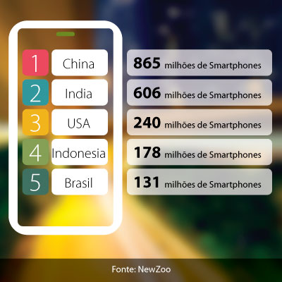
 Every day the number of people who have a smartphone increases. According to the site survey Newzoo, Brazil is the fifth country in the world in terms of number of smartphones. There are 131.71 million (2020 data) and the number continues to grow. You’ve probably used it to find out some information on a website.
It makes sense to ask yourself:
- Will my website look good on a smartphone?
- Should I build a new website for mobile users?
- Must I have a special website for tablets, too?
The first question can be answered with a very simple test. Open your website on a smartphone. If it appears reduced on the screen and when browsing the content it is not possible to read the texts without zooming in and running from one side to the other, your site is not adapted for mobile phones.
The answer to the second question is probably yes. But you only need one website, not 3 (desktop, tablet and mobile).
The first cell phones had very limited internet access, so the first websites that were developed for cell phones used browser detection technology and redirected the customer to the mobile site. The mobile site had different content, more summarized and with a completely different form of presentation from the desktop site.
Cell phones have evolved and so has the bandwidth for internet access. Today with 4g technology it is possible to have faster access than many cable connections.
With this it is possible to deliver to the user the same content that the desktop site has. The main problem is formatting. To solve the problem, Responsive Design is used.
Responsive Design is a technique that uses the same html page modifying the presentation according to the width of the screen. The website is designed with a more fluid form and immediately reorganizes itself if the screen changes size (change of orientation). With that comes the answer to the third question, you don’t need a tablet website either.
With Responsive Design only one website is developed, but it is carefully planned so that it always displays the content at its best on various screen widths. The content that on the desktop can appear side by side, on a mobile device moves with the main elements above secondary. The menus are also resized, leaving room for you to navigate using your finger, which is less accurate than the mouse.
Other solutions can still be used as dynamic serving or mobile-only sites, but only in cases where a different mobile experience is really important.
Usually users access the same site from a cell phone and computer and want to find the same text and images. For that, Responsive Design is the best answer.
