

 To start, we will present three ways to write a text:
- UPPER CASE
- lowercase
- Upper and Lower Case
That said, let’s get to the point: when should and can we use each of the three forms of writing mentioned above? Many might say that writing in all caps is impolite as it means you are yelling, but this is a relatively new interpretation of the question. This is said because of NETiqueta, or internet etiquette. I don’t know if the term is still used anymore, or if anyone still explains it to their children, but as soon as the internet came along, and with it the possibility of exchanging text messages without sending a telegram, everyone learned that writing in capitals it was SCREAMING.
But what about science?
This article is about something I became aware of long before the internet became a part of our lives. As soon as I started my graphic design career, my boss forbade me to write anything in all caps. Everything should be written in upper and lower case, whether titles, intertitles, signs, forms or whatever. I found it strange at first, as it was quite common to use capital letters in bonds and decided to ask why.
He told me that uppercase and lowercase text has better readability. Studies have proven that we read text by word form recognition. For this reason we can read a text with inverted letters or even numbers in places of certain letters, as long as the words have the right length and start and end according to the correct version. In addition, lowercase letters have more “personality” in their design than uppercase letters, helping to recognize words and increasing reading speed.
This information completely changed my training as a Graphic Designer. From there I understood that the role of the Designer is to ensure that information reaches the reader in the best possible way, and not in the prettiest way. Of course, aesthetics are important, but it’s useless for content if it’s not used to enhance it. Many designers have forgotten about this and do their job just worrying about making something more beautiful.
Uppercase or lowercase. What to do with it?
Therefore, since my time as an intern, I have been explaining to people that, contrary to popular belief, capital letters do not give more readability, on the contrary, it gives less. An example of the application of this study is traffic signs. Virtually all text on road signs is written in upper and lower case. Legibility is critical to road safety. Note that you can only find signs in capital letters in small towns, where probably the people responsible for the manufacture have no idea what legibility is.
 The strangest thing is that people’s resistance to this information. As there are a multitude of signs and signs made in capital letters, people tend to believe that this is correct.
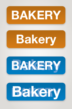
The first discussion that pops up is that the text will be smaller in upper and lower case. I always have to explain that it’s the exact opposite, it gets bigger. Let’s write the same word both ways to see what happens.
BAKERY
bakery
You will say: see, it got smaller! Let me explain: normally the problem with writing on boards is the width of the board. If we take the same width for the two examples, the text written in upper and lower case will be approximately 25% larger. See example on the side.
Therefore, I continue to explain to all clients, colleagues and readers that writing in upper and lower case is a matter of science.
Is that you? Do you prefer to write in uppercase or lowercase?
